Hi, I’m @cobyism.
Here’s some of my work.
GitHub
During the last ~5 years as a product designer at GitHub, I’ve learned a great deal about the challenges of iterating on a highly technical, high profile product.
GitHub designers work closely with engineering on the implementation of new functionality at all layers of the stack. During my time as an individual contributor (Jun 2012 to Jan 2016), I was the 13th highest overall contributor to the GitHub.com codebase by commit count.
While commits aren’t necessarily a useful proxy for what matters, nor is this repository they only codebase I worked on, I’m extremely proud to have been part of the core team for such a fascinating product over a significant period of growth and change.

I moved into a management role on the design team after this, and my individual contributions became less frequent due to this shift in focus.
Let’s take a look at a few things I worked on over my time at GitHub.
Web Flow
Getting people hooked on GitHub was tricky, until we gave them a way to quickly get a feel for the GitHub workflow without having to dive into git on the command‑line.
We knew that people who used Pull Requests early on in their GitHub journey were the most likely to end up staying engaged over the long run. What we needed was a way to help new users achieve the basics of collaboration using only their browser.
In an ongoing effort we internally referred to as Web Flow™, we expanded GitHub’s ability to edit files in the browser to also allow people to create, delete, move, and rename files.
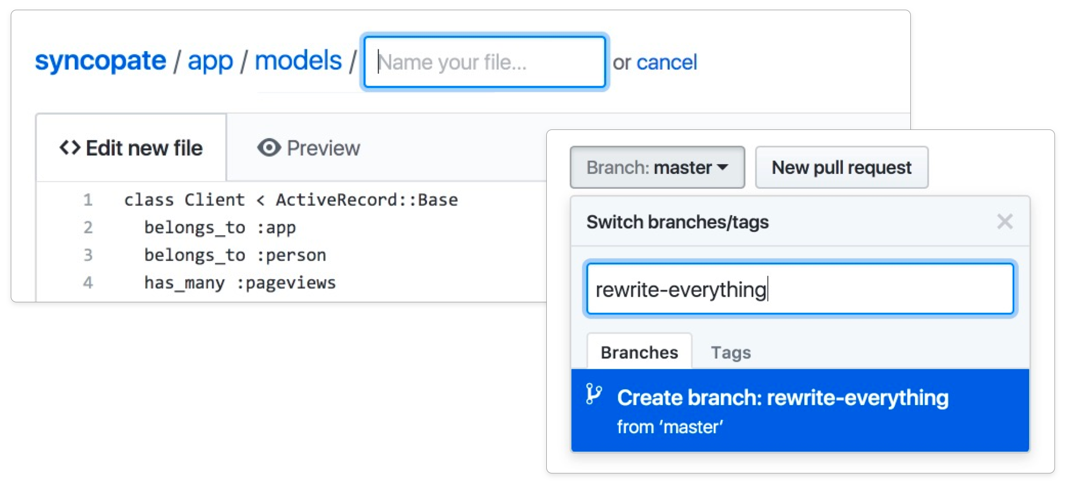
Moving and renaming files proved to be a tricky interaction to design, for a number of reasons. You might want to move and rename a file at the same time, the destination folder might be further up in the folder tree, or the new location may not even exist yet. It’s hard to provide access to such flexible functionality with only a small amount of space, without cluttering up an already-complex interface.
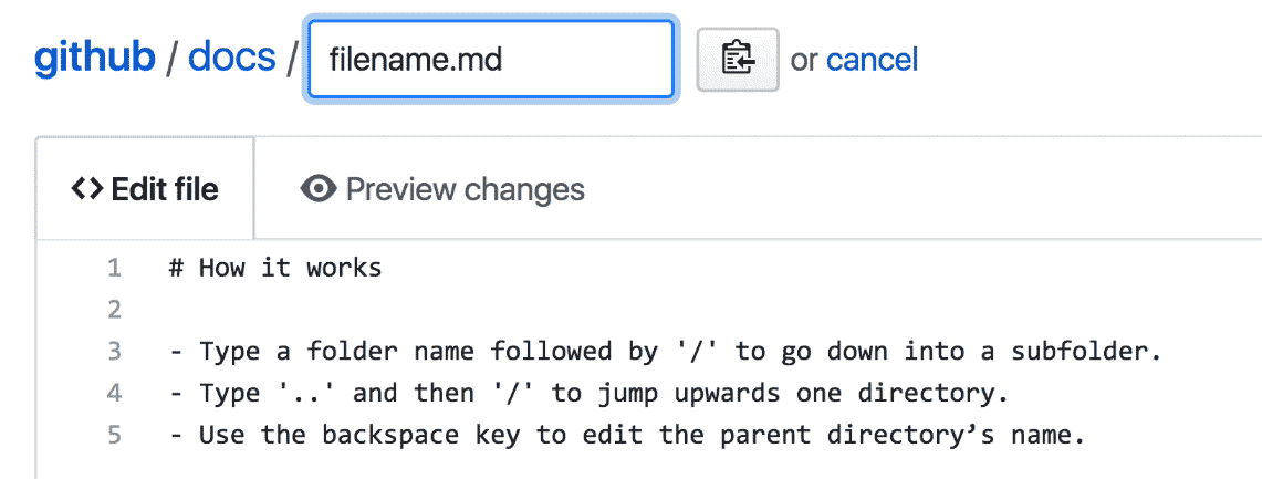
In designing the solution we ultimately chose, I leaned heavily on the conventions used by command-line applications—with slashes delineating between folders and sub folders, and with ../ acting as a way to navigate to the parent directory.
Once the basic file operations were possible, we continued expanding the functionality to allow for collaborative actions too—creating branches, editing Pull Request files directly from the diff, and tidying branches up after Pull Requests are merged to keep everything tidy, and so forth—until every step of the GitHub Flow cycle was possible using only the browser.
Quick Pull Requests
As the Web Flow features gained traction, we began exploring entirely new functionality to expressly encourage people into collaborative workflows, at times where review and feedback might otherwise be missed. One of the more prominent examples was Quick Pull Requests.
One reason getting started with Pull Requests is hard is that people often forget to create a new branch before making a change. Whenever someone goes to make a change to a repository using the browser, Quick Pull Requests provides the option to make the commit on a new branch, there and then.
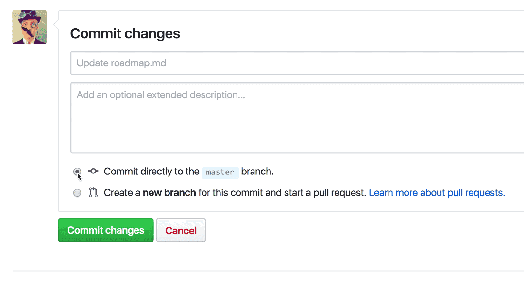
By saving people from having to remember to create a branch first, and redirecting them to open a Pull Request asking for feedback on their suggested change, even small changes can become valuable discussions and opportunities to improve software quality.
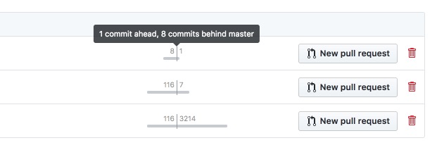
Branch list
Performace-wise, the Branches page was one of the slowest aspects of the whole site—with the branches page taking up to 12 seconds to render for some projects.
Balancing interface-level utility with Git-level performance constraints was almost impossible, so a redesign had been avoided for years. When I tackled this project, I worked closely with engineers on the systems team to ensure the new design was both useful and performant—ultimately reducing both the average and 95th-percentile load times to more acceptable ranges (~300-700 ms).
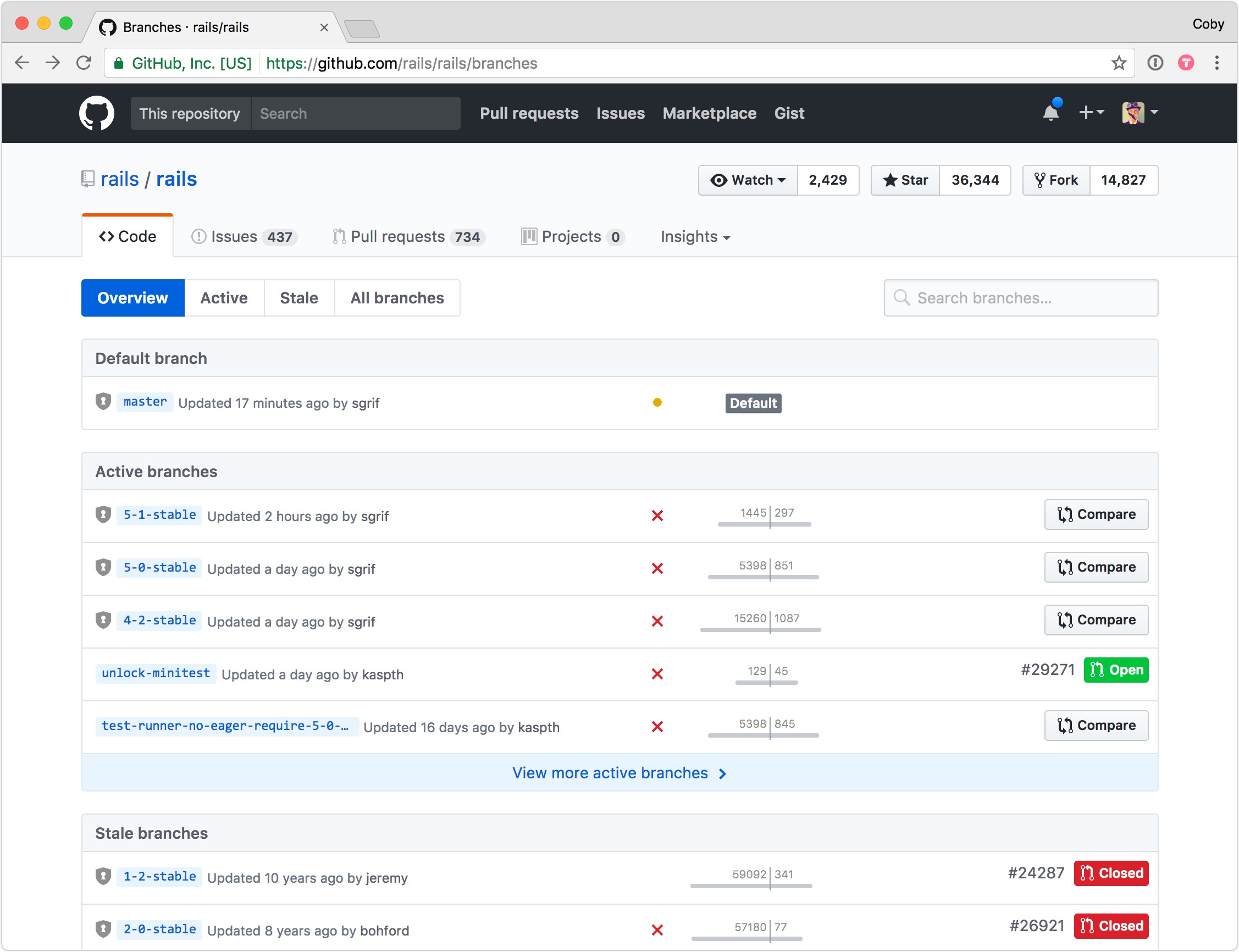
Scannability was a key goal on this page, since aside from the name of the branch—there isn’t much else to differentiate one from another in a long list. To combat this, I designed a small, unobtrusive graph to convey how far ahead or behind each branch is compared to the default branch. By adding a subtle animation to this graph as the page loads, your eye quickly becomes drawn to branches that are further in-front or behind.
The area that took the most iteration was the right-hand side of the screen. Due to the myriad combinations of user-, repository-, and branch-level permissions—as well as Pull Request existence and status—the available actions and meta-information needed to both fit within a small space, and be queried without incurring much performance overhead.
Between the animated graph, the commit status indicator, and the clear sections and actions, this new design ended up striking a satisfying balance given the tight performance limitations involved.
Onboarding
On more than one occasion during my time at GitHub, teams were formed to tackle, onboarding, engagement, and retention concerns. Being close to my heart, I put my hand up each time the opportunity came up.
Due to the exploratory nature of user growth problems, my time on these teams involved partnering closely with research, engineering, and analytics teams. This is an area that GitHub hadn’t historically invested in, so much of the work was laying the foundations—building up our internal tooling for surveys and collecting feedback, instrumentation of key workflows, and running experiments to determine baseline behaviour for later optimisation.
Some of the earlier successes we saw on this team were a redesign of the "blankslate" welcome page that boosted 90-day retention by ~30%, the addition of email verification functionality to the registration process, and the implementation of a flexible survey framework which we used to collect a number of interesting findings (did you know that 70% of people signing up to GitHub each week don’t know Git?) to fuel further research.
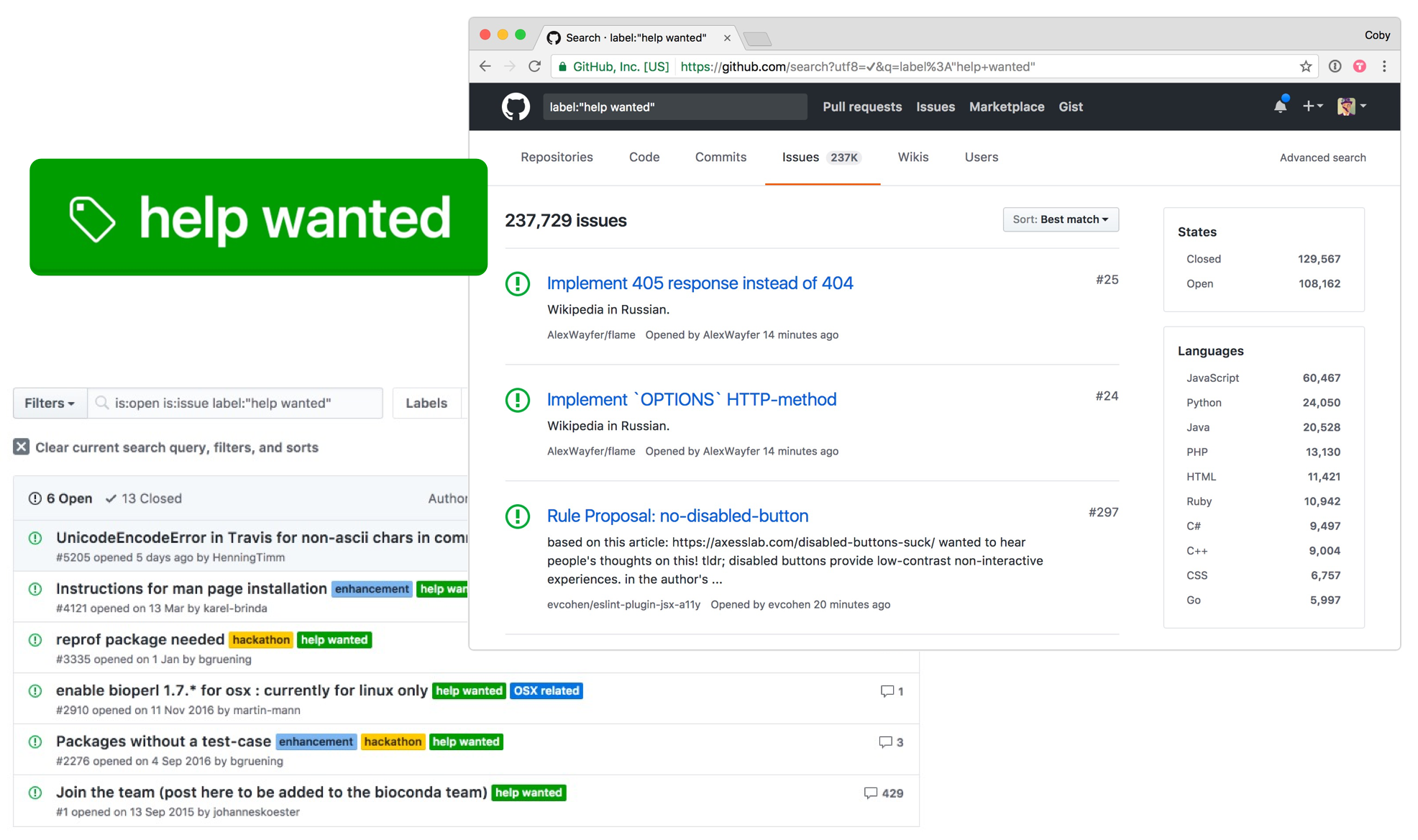
Help Wanted
An interesting discovery from early onboarding research was a significant portion of new users wanted to get into open source, but didn’t have a project to work on.
As part of the early efforts to improve the onboarding experience, we explored ways to match new users with projects where the maintainers were seeking contributions.
In our early prototypes, we imagined new users being directed to a "help wanted" area at the end of the sign up process, where they could indicate a topic, subject, or technology they were interested in helping with—e.g. "docs", "ruby", or "design". Based on this, they’d be shown a list of issues that were waiting for contributions, so they could pick something that looked interesting for their first foray into contributing to open source.
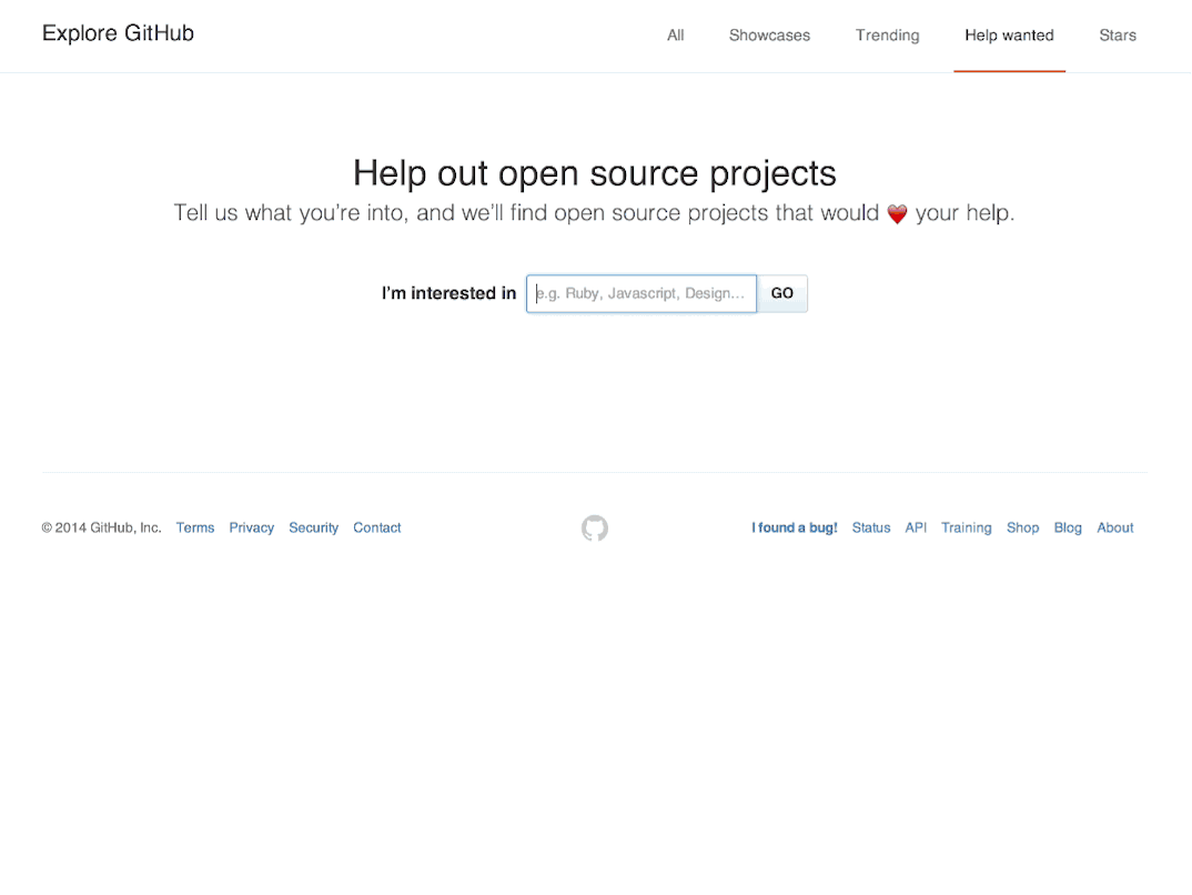
Rather than building any dedicated functionality into the product to allow maintainers to opt-in, we decided to leverage an existing part of the product—Issue Labels. When new projects are created, we pre-populate the issue tracker with a number of default labels for bugs, suggestions, questions, and so forth—so we simply added a new "help wanted" label to the default set, and flipped it on for people to begin using.
In addition to the label as an explicit opt-in, we imagined that the onboarding flow would also look at other signals—such as a minimum star-count on the project, or considering the number of previous contributors, etc.—to improve the quality of the results, and thus boost the chances of new users having a positive experience contributing to open source.
While the onboarding part of this project was unfortunately mothballed for other reasons, the help wanted label has become heavily used, and it’s now easy to use GitHub’s search functionality to find issues where maintainers want help. Pairing a search for the "help wanted" label with additional labels (e.g. documentation), yields large numbers of potentially relevant results.
I hope GitHub finds a way to connect new sign-ups to the open source community in the future.
Reblame
When debugging a regression or trying to understand how a piece of code came to have its current shape, a common workflow is to use the "blame" view of a file to understand how changes have been made over time.
In active codebases though, tracing individual commits backwards in time was painstaking and often involved repeating 5 or 6 steps over and over again. Reblame was a small but powerful feature we built to fix this.
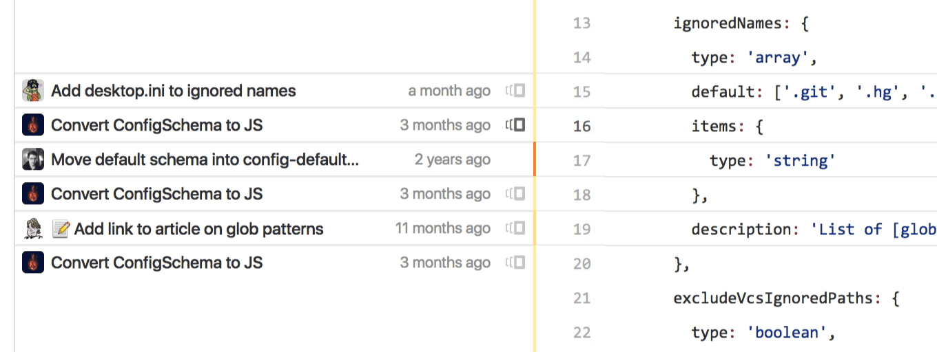
Instead of clicking on the commit for the line in question, identifying that commit’s parent, browsing to that version of the codebase, finding the file in question again, and then scrolling back to the same part of the file again—clicking on the small icon we added next to each chunk of code lets you skip straight to the prior blame view you want.
When designing this feature, we didn’t want to simply introduce more complexity to an already complex interface, so we actually started with an audit of all the information we were showing for check of code, and managed to reduce it to just the critical pieces of information. As a result of streamlining first, we had space to introduce the Reblame functionality while ensuring the overall change felt like a simplification.
Open Source
Jekyll’s documentation
Shortly after joining GitHub, then-CEO and founder @mojombo approached me about working on a revamped documentation site for his Jekyll static site generator project.
I worked closely with Tom and the core team of maintainers to port the existing wiki content over to a clearer documentation structure, and designed a site that would hopefully set the project up in a way that would allow further growth and iteration.
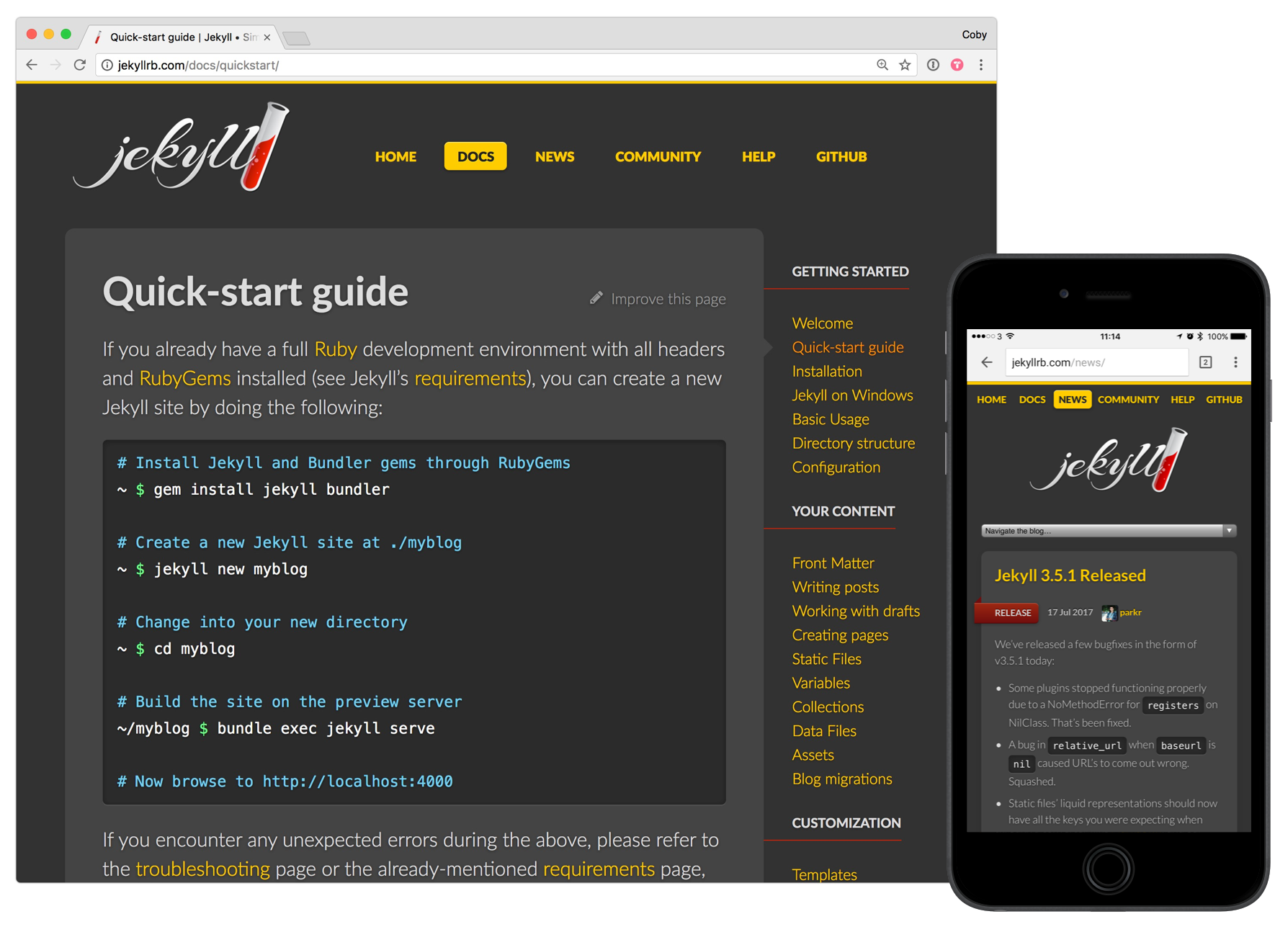
While the aesthetics of the site haven’t held up to time as much as I’d like, this site has worked well as the project has evolved and grown over the years, and I’m proud of the choice I made about navigation structure, visual heirarchy, and content architecture.
This project was my first significant open source contribution, and the process of designing completely in the open (both here, on internal GitHub projects with the rest of the design team) put me on a course to reconsider how I thought about the design process.
Ghost On Heroku
When Heroku released their deployment API, I decided to build a one-button deployment option for the open source Ghost blogging platform.
Product thinking doesn’t just apply to visual interfaces—APIs and integrations are products too. Maintaining this project over the last couple of years has been an interesting exercise in maintaining focus on a simple, single "job", despite suggestions and distractions in all directions.
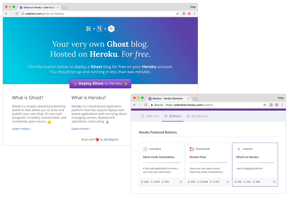
This integration ended up becoming quite popular—so much so that Heroku have listed is as a featured button in their "Elements" integration directory since mid-2015.
Thanks for reading.
I’d love to work with you.
Drop me a line.
💖