
The more we explored the potential of pre-conversation self-serve, the clearer it became that we’d discovered a huge opportunity to leverage Intercom’s Messager to solve problems for our customers in entirely new ways. A new era for the Messenger was about to begin…
Let me start by saying… making any change to a Messenger experience receiving upwards of 500 million conversations per month is no joke 😅—let alone a complete first-principles redesign, so this wasn’t something we entered into lightly.
Note: You can also read more in-depth about this project in this announcement post by Paul Adams (CPO), as well as this write-up published by Brian Donohue (VP Product) on the product thinking our team did to drive this project.
The story so far
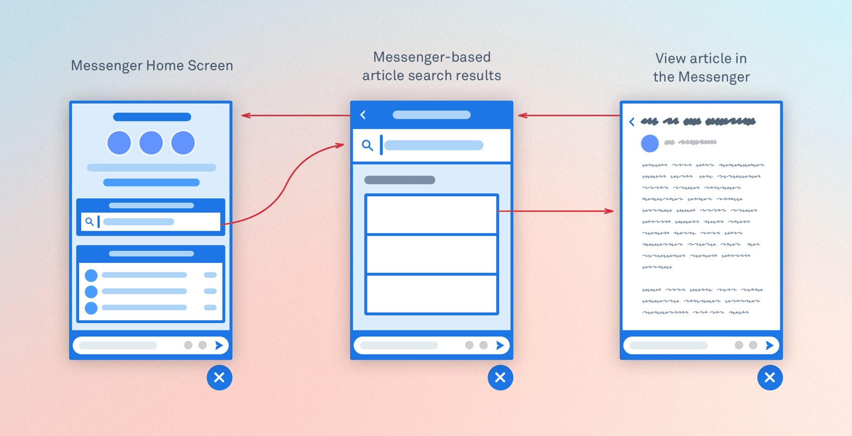
To briefly summarise how we got here… Our initial insight gathering started with the smallest and simplest thing that might possibly work—a link on the new conversation screen prompting people to try the help center. When we turned it on for a small group of customers, it turned out way more people tried the help center before starting a conversation than we’d predicted.
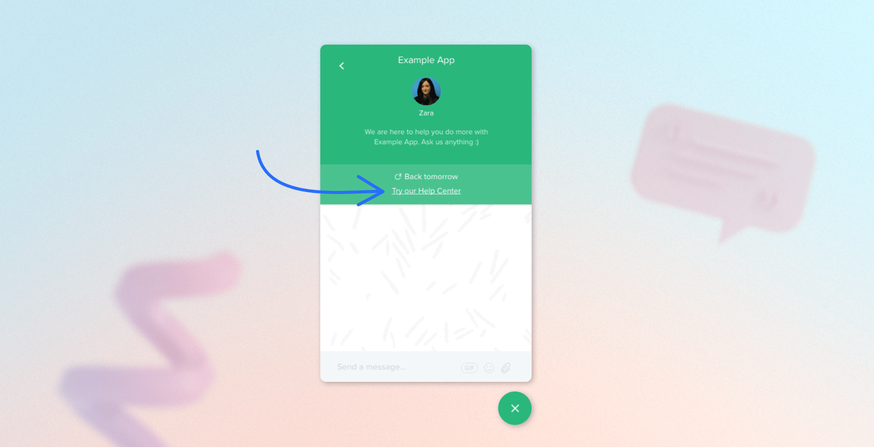
Spurred on my the data we were seeing, we started exploring options to take this direction further—for by expanding the Help Center link to become a dedicated search input which would launch people into the help center with more context.
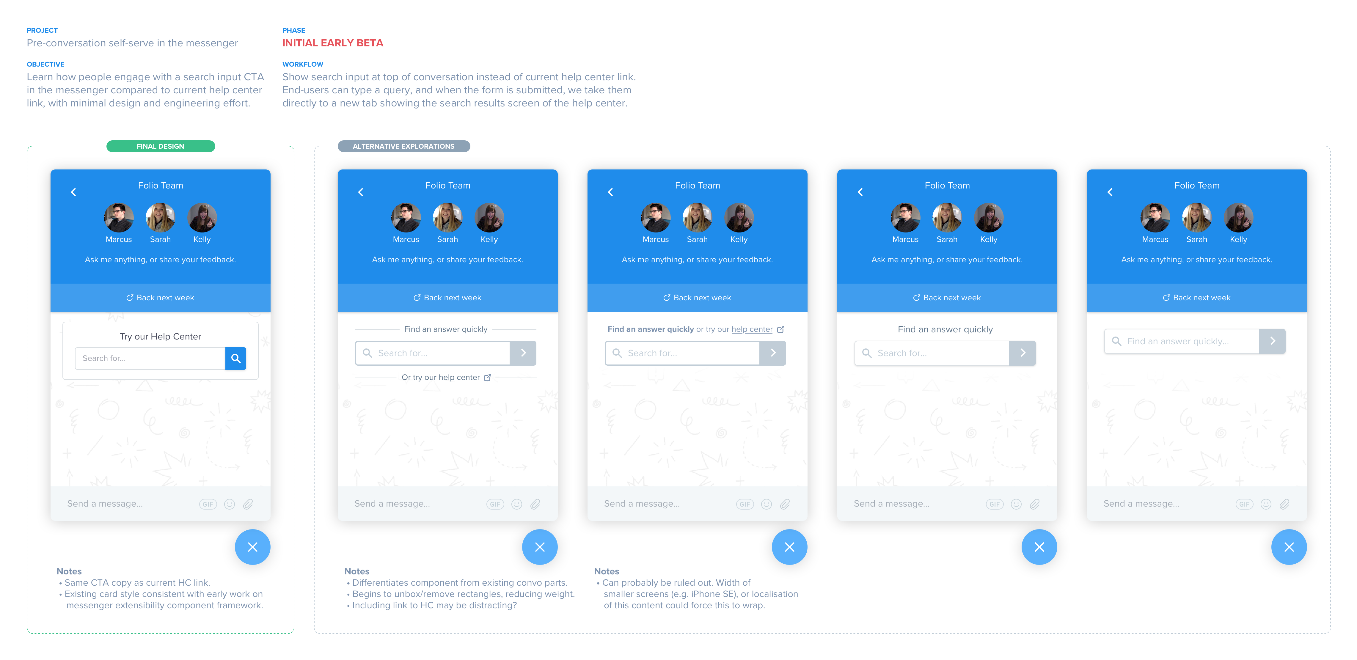
While this direction had potential, the key challenge we kept running into as we explored was that this was still dependent and too closely coupled to the "new conversation" interaction—even if someone finds this useful, the only way to find it again was to click through to the new conversation screen again.
Expanding upstream workflows
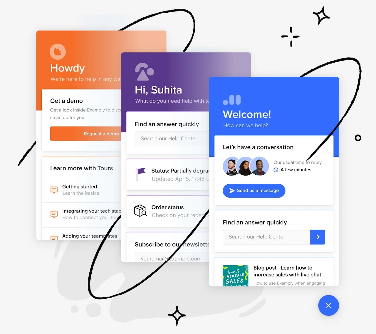
What we really needed was to somehow capture people’s intention to self-serve and give them the answers they needed one step upstream of this whole new conversation touchpoint. Only problem was… there were no upstream steps!
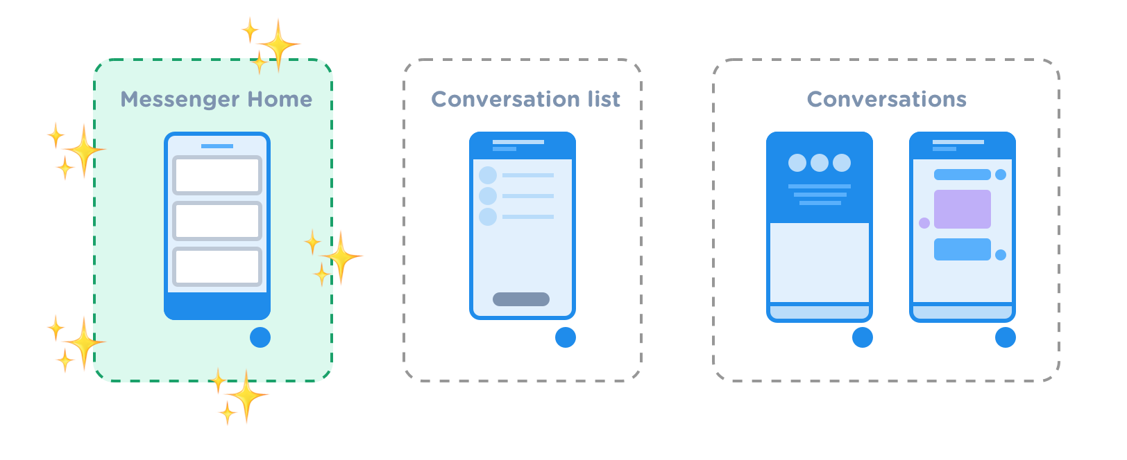
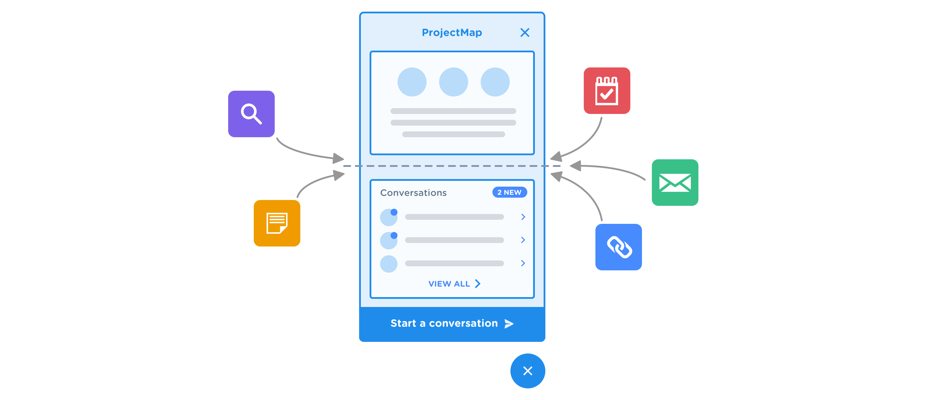
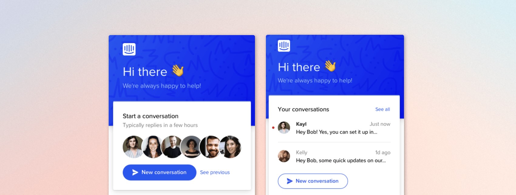
The Messenger had only ever consisted of two screens: a list of conversations, and the new conversation screen—and if you didn’t already have conversations then opening the Messenger would only show you the one "new conversation" screen. There simply wasn’t another location in the Messenger’s UX to even work with if we wanted to try and capture people’s intention to self-serve. So the next step of my design process was the ask the question—what if we created one?
Looking for prior art
When I looked around at other products and experiences to understand the potential landscape, there were a number of clear examples of companies trying to build a variety of "home screen"-like functionality via a Messenger-like launcher. Some of our own customers had even built solutions to place intermediate step in front of Intercom’s new conversation interaction.
Solving the original problem
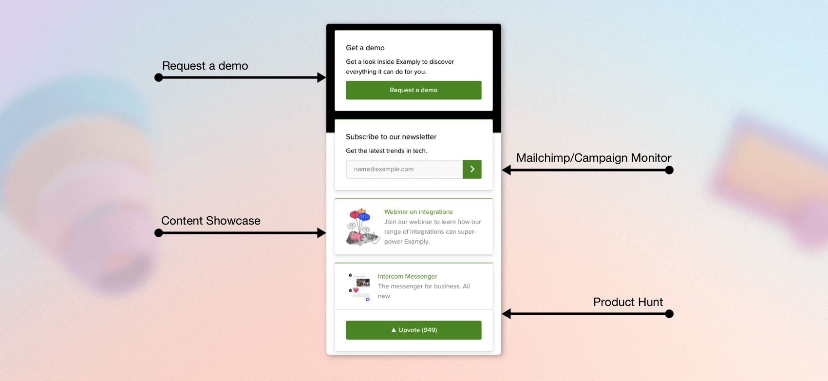
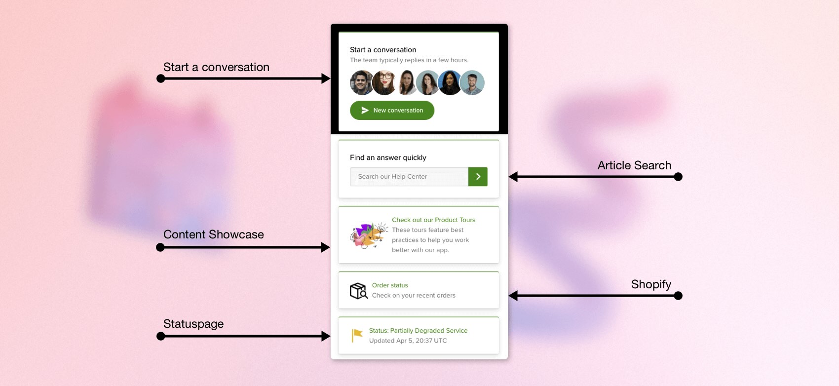
With mounting evidence suggesting the potential value of a space of some kind existing upstream of conversations, I started exploring how a "home screen" approach might work for our specific use-case of connecting end-users to help center articles to increase self-serve rates. It seemed to solve the problem nicely—and by this point my concept designs had started doing the rounds internally for feedback, which strongly indicated this approach was worth pursuing.
Opening up new possibilities
Introducing a "home screen" was valuable because it went beyond simply solving our immediate self-serve use-case—it essentially turned the conversations (which was previously the entire Messenger experience) into "just another app" inside an incredibly flexible Messenger, which immediately opened up a world of possibilities for how we (and more importantly, how our customers!) could leverage the Messenger in new and interesting ways.
New visuals and branding options
In addition to the flexible utility and customisable (even targeted) content that was possible with the new Messenger, the home screen also opened up the potential for us to give our customers much more fine-tuned control over the visuals and branding. We wanted this new messenger to really feel like it was theirs.
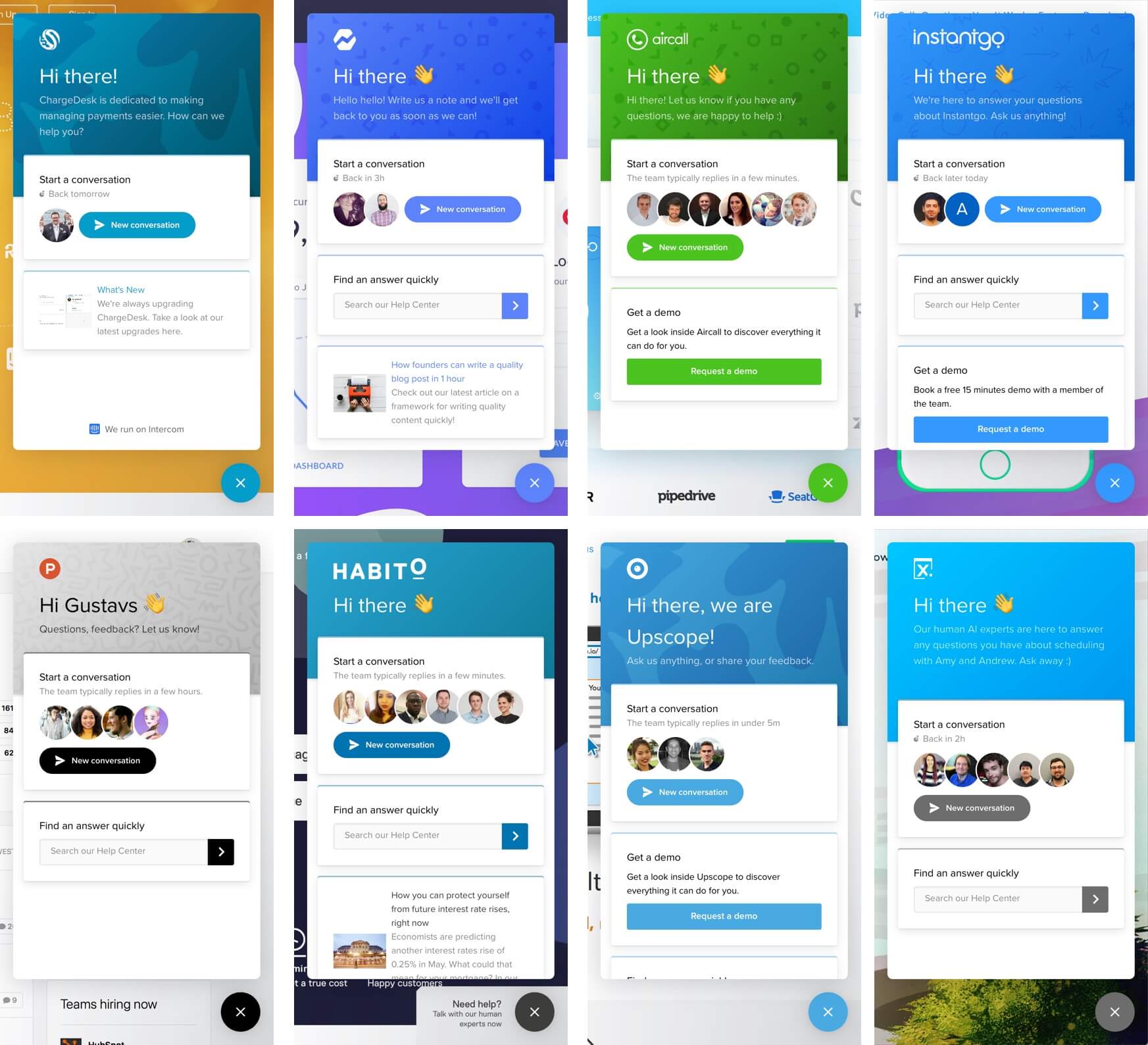
Where before we only had the conversation list and new conversation screens to work with, the new home screen could become a flexible "welcome mat", upon which our customers could customise intro and welcome messages (in multiple languages, and with per-audience targeting!) to set tone and voice, all in complete alignment with their brand.
As the vision for this project began to take shape, and multiple teams of designers, product managers, and engineers became involved, we had no choice but to break the project up into a few parallel workstreams—and with our London team having been the ones driving the initial vision we ended up playing a large coordination role across 6+ product teams involved in getting this across the finish line.
Bringing Messenger to life with motion design
With Messenger Home on its way to becoming a reality, the other workstream I took point on was working with some of Intercom’s principal engineers to explore the ramifications this new direction for Messenger would have for the underlying API architecture and performance, and the role front-end motion design could play in managing latency while simultaneously maximising perceived speed.
The key complication our new Messenger app architecture presented was that when opening the Messenger on a customer’s website, no longer were we just showing the new conversation screen or a list of conversations (both necessitating only minimal API calls). Going forward, our Messenger needed to:
- Display custom visuals and branding, logo, etc.
- Show localised intro messages depending on end-user language.
- Determine which home screen version to show based on end-user audience.
- Render an essentially arbitrary list of apps configured for the home screen.
- For each app, determine the state to display and fetch any additional resources.
Multiply all of this by the number of websites with the Intercom Messenger installed, and the ~500 million conversations we handle each month, and even conservative estimates begin to produce some face-melting numbers. Put bluntly, our JavaScript snippet needed to do all of this without unintentially DDoSing Intercom’s servers via our own Messenger, and without overloading browser bandwidth consumption for end-users.
Through a lot of experimentation and iteration (which I’ll spare you, as it could take up an entire case-study of its own!), we eventually arrived at a solution which took advantage of a combination of motion design principles—such as progressive loading, staggered entrance animations and transitions—to maximise perceived speed and minimise the impact of any latency on the overall experience.
Designing the rest of the ecosystem
With the core Messenger Home concept and motion design principles in place in a way that gave myself and the principal engineering team sufficient confidence in the performance and API load considerations of the Messenger’s new front-end, the next stage was designing… the rest of the new Messenger ecosystem. 😅
Fellow senior product designers from adjacent teams took over and continued fleshing out final visual design details for the home screen, the UI framework for Messenger Apps and extensions, prototyping the first apps we’d be launching with, and integrating apps with our custom bots functionality.
Meanwhile, I took point on designing the remaining key touchpoints for this new Messenger App ecosystem—settings and configuration areas our customers would use to migrate to the new Messenger, set up their new home screens, and install integrations from the Intercom App Store—as well as working closely with the content strategy team to craft a compelling roll-out and onboarding experience for our customers.