Way back in the pre-GPT3/ChatGPT LLM stone age of 2018 (lol 😂), I led product design as part of a small team which came together to build and launch Intercom’s first ever AI-driven chatbot product. Getting a machine learning-based chatbot to market early gave us a huge a head start over our competition industry-wide, and helped establish a competitive moat for Intercom’s platform.
Note: You can also read more in-depth about this project in the announcement by Brian Donohue (VP Product), as well as this inside look at the way we built the product.
Straight off the back of leading product design for a complete redesign of Intercom’s Messenger, our team in London returned to our core focus of solving the problem of resolving inbound support queries as efficiently as possible, and ultimately enabling our customers to support more of their end-users with less effort and smaller teams.
A unique competitive opportunity
We’d historically avoided exploring bot-centric approaches—the tech was still very immature, and the majority of products we’d seen taking this approach mostly just ended up creating terrible and confusing experiences for end-users, and that wasn’t what we wanted for our customers.
As part of our regular competitive research process however, we started noticing some emerging patterns and trends, which essentially boiled down to two key observations:
- New products in our competitive landscape were increasingly being built around the idea of entirely automating the support process with conversational chatbots.
- Many of our most successful customers had consistently invested time and energy into building (and maintaining!) content libraries to quickly resolve their most common queries with minimum effort—thus far in the form of saved replies and help center articles.
The apetite clearly existed for solutions in this space, but the crux of the initial problem wasn’t generating content via AI/ML, like many products were taking aim at—matching accuracy and smooth UX were the key. The core question: How can we reliably deliver accurate answers, without creating workload by requiring a human to be involved in the conversation?
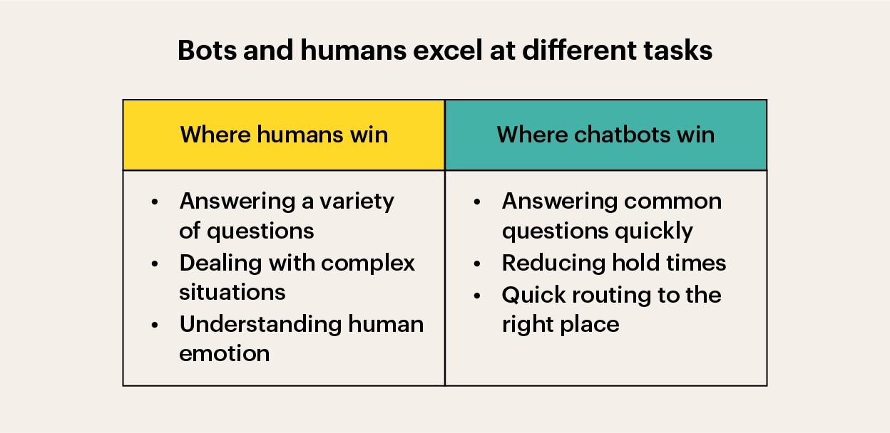
Everything we saw suggested we had a unique window of opportunity to productise a solution that really got the balance right between support content curated by expert humans and automated delivery and resolution. If we could crack this, not only would it be a game-changer for our customers—it would give us a huge competitive advantage in the industry.
So… it fell to our product team in London in combination with the talented engineers from our newly formed machine-learning team in Dublin to figure out how to build an AI-chatbot and successfully bring it to market. No biggie, right? 😅
Validating with prototyping in production
What good would a 30% resolution rate be, if the remaining 70% of the time our product just made things worse? What if an automated interaction of any kind ended up frustrating and confusing end-users way more just waiting a little longer to speak to a human? For our customers to ever trust a product enough to use it at scale, with their brands and reputations on the line, nailing those interactions would be mission critical.
So we started small. We identified a small handful customers that were willing to help us with early research, worked with their teams to create a small library of content and trained some rudimentary matching models over their inbound conversation history. No interfaces, no fancy UI, just a simple series of tests to establish:
- What hit-rate might our initial stab at the ML algorithms achieve?
- How would end-users respond to an attempt at automated resolution?
- How would interactions go when the system got it wrong?
- How would the hand-off process to a human agent work?
What we saw was incredibly promising. The success rate averaged a bit over 20% across our initial test group, which was higher than the 10-15% we’d expected from our very basic initial models.
Most importantly though, as we manually reviewed all the conversations, we saw virtually no instances where the bot getting it wrong resulted in negative interactions and sentiment. When the answer wasn’t right, end-users would almost universally just trust the handover process and wait for a human.
We were onto something—so we reviewed the opportunity and the initial research with our top level leadership, and got the go-ahead to double down and tackle this problem for real.
Preliminary scoping
Talk about unknown unknowns! Breaking new ground in a space like this is a huge challenge, and we knew we’d need to be prepared to iterate and adapt as we went. We also knew that we’d need to be very careful about how we scoped the project, and how we defined success for the each of the various components of the system.
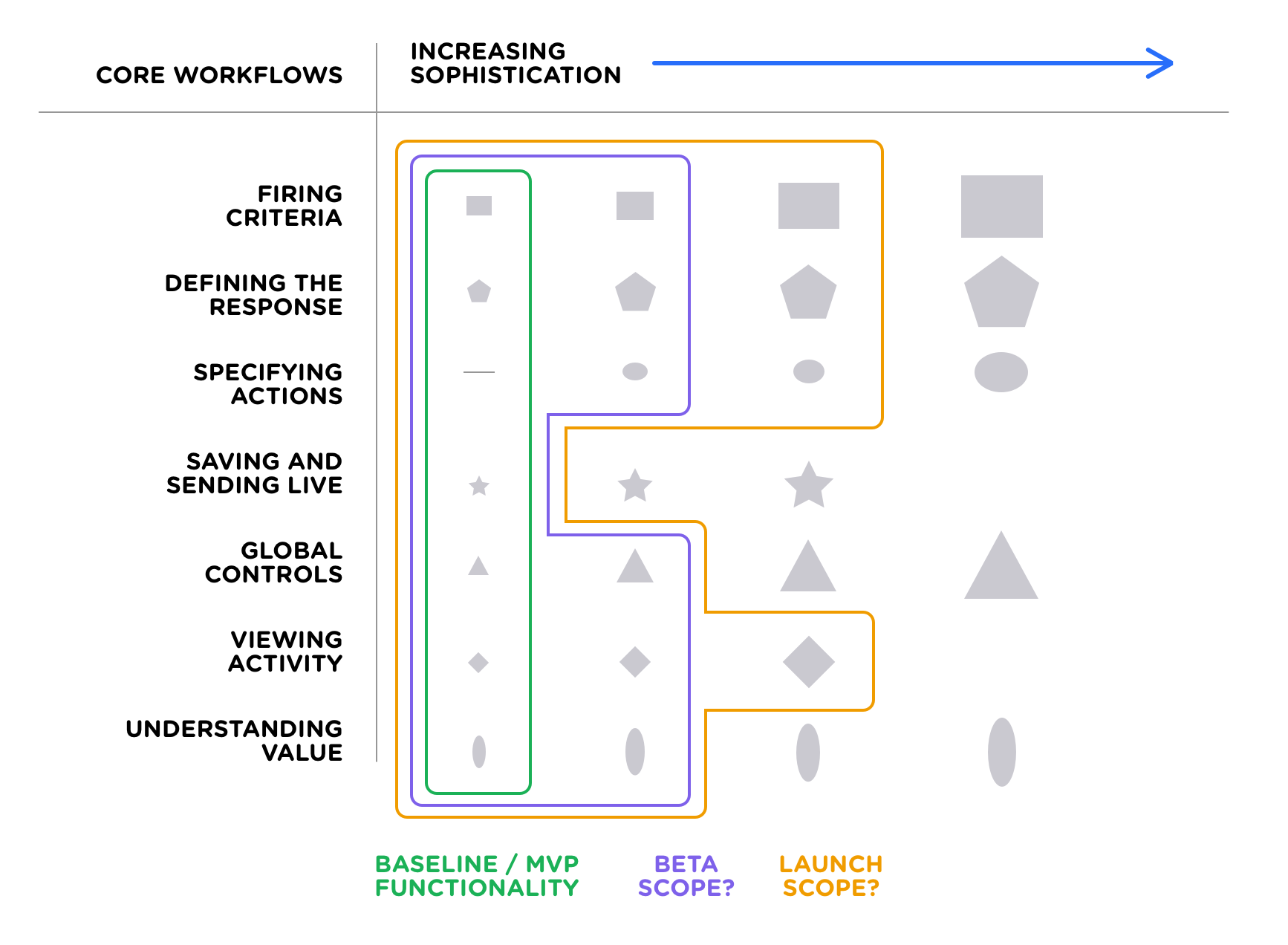
The approach I’ve found to work best when breaking down the solution space for complex problems tends to look something like this:
- Enumerate the various component parts of the problem space.
- Identify a spectrum of possible sophistication/complexity/investment levels.
- Converge on scope boundaries for each launch/release phase.
By facilitating cross-discipline discussion at the scoping stage, it helps give everyone a shared understanding of the areas of focus, significant unknown variables, estimated complexity, sequencing, and relative investment of time/energy.
Mapping the system model
We took the learnings from our initial research prototype, and began making some slightly more well-informed system-level sketches for how the various components of the system might fit together.
Based on our initial research we already had a somewhat clear idea what the necessary workflows were initially going to look like for the end-user facing logic, key interactions between end-users and the bot, and the support agent hand-off logic.
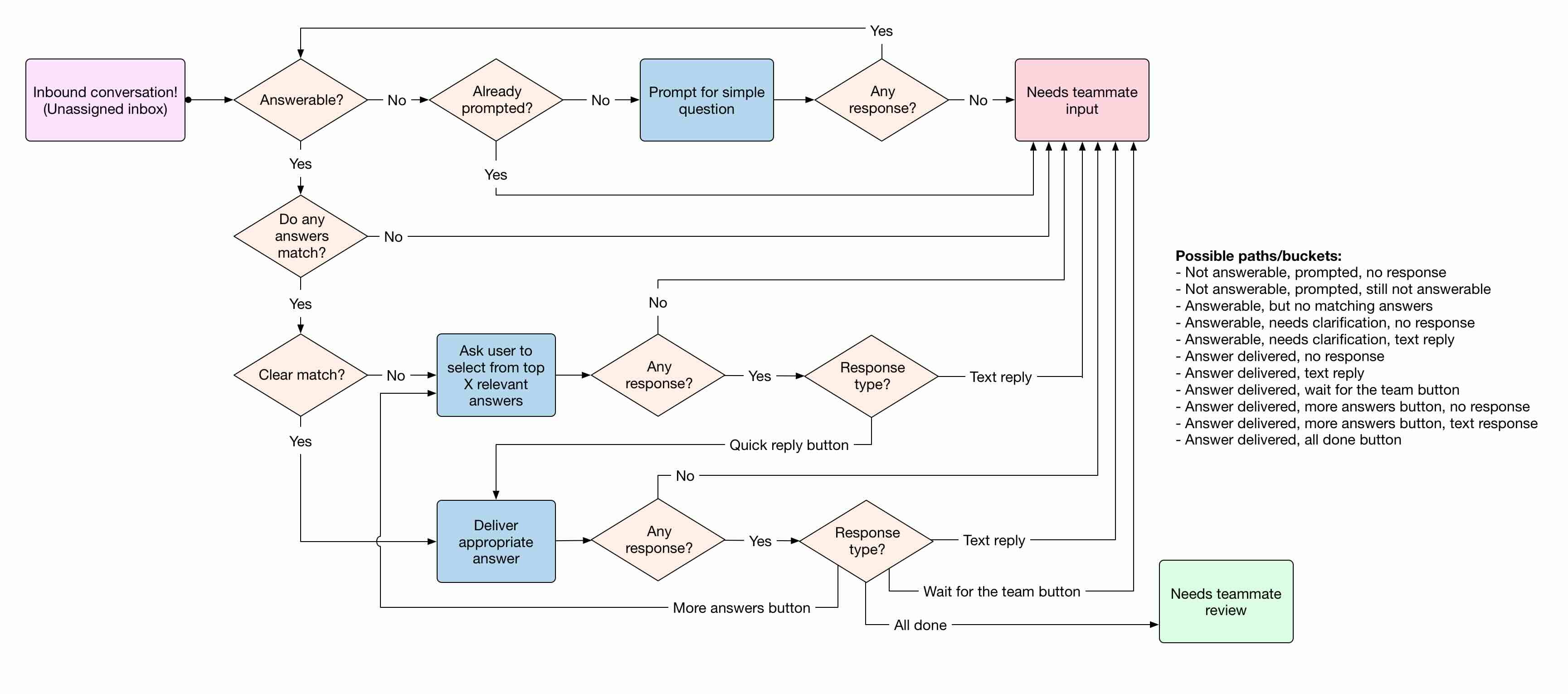
The biggest set of unknowns we needed to begin putting some shape on was the system we’d be putting in front of our customers for training the system based on their conversations, managing the content to deliver as answers, and ways to provide reporting and visibilty into how the system performs.
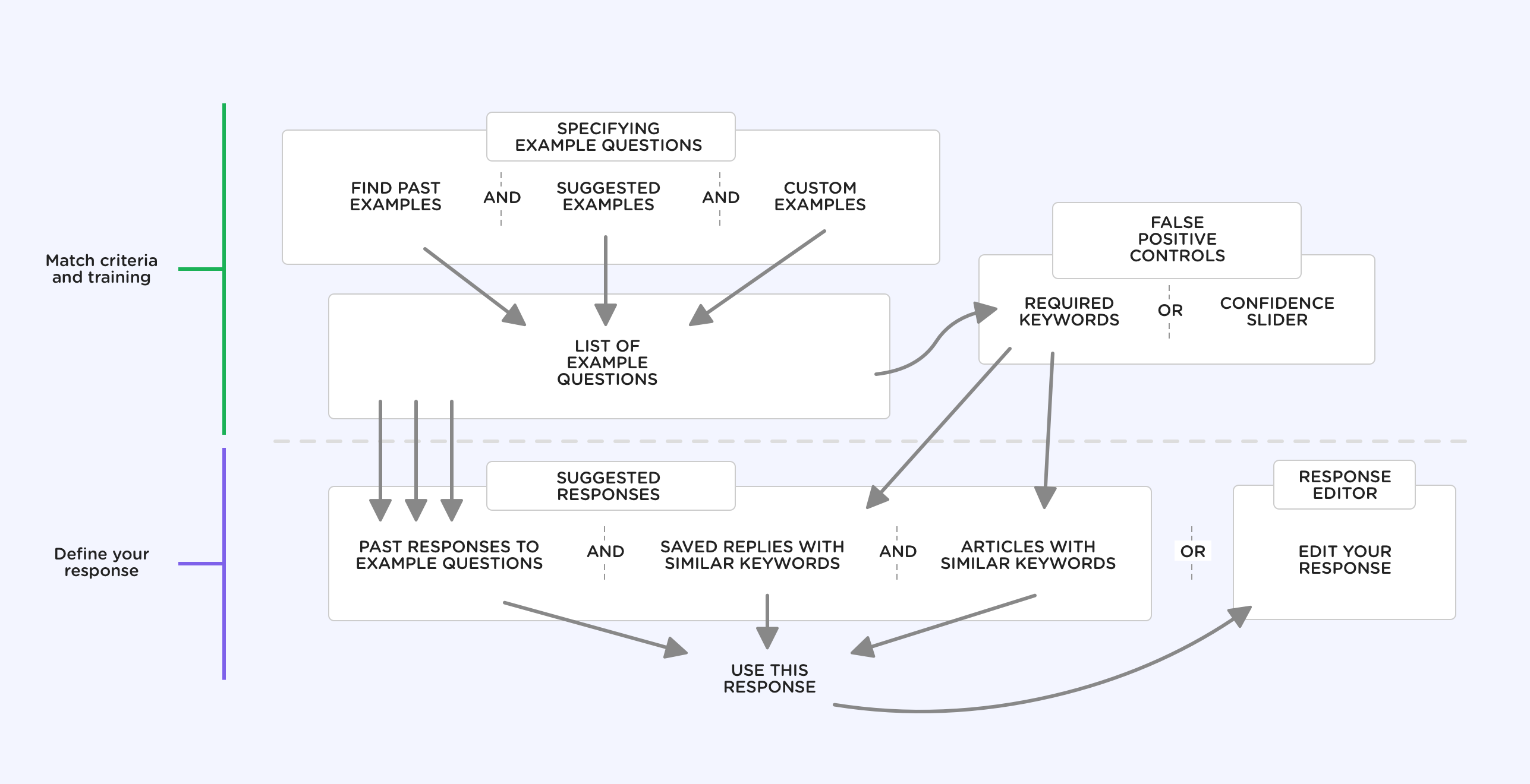
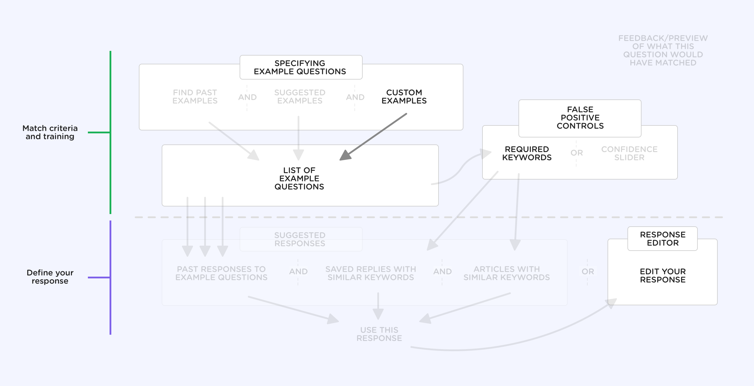
We knew this system model would evolve over time as we learned more about the problem during the process of design and development, but it was as good a place to start as any—so with that we dove head-first into the design process.
Questions? Answers? Clusters? Oh my…
The core of the ML-system centered around a single problem: what question is the end-user asking? The problem with that question though, is that it quickly devolves into a number of tricky sub-problems:
- Questions can be asked multiple ways, and still mean the same thing. When this is the case, how do you refer to the general question as a whole (including all of its variants)?
- Superficially similar questions can have very different meanings. Sometimes the addition of an extra word or two, or a slight reordering drastically changes the semantic meaning.
- Queries may contain multiple questions, or be ambiguous. Should we take keywords from all of the questions into account, or just focus on one question? Should we provide multiple answers?
- People starting conversations might not ask their question in the first message. What threshold should we have for considering something "answerable"? If it’s unclear, can we gracefully prompt the end-user for more without causing frustration?
- For some key questions, there’s a lot at stake if the answer is wrong. For example, questions relating to billing or account security. How can we be sure we don’t trigger false positives for other low-stakes answers, or reliably ensure high-stakes questions will always get escalated to a human?
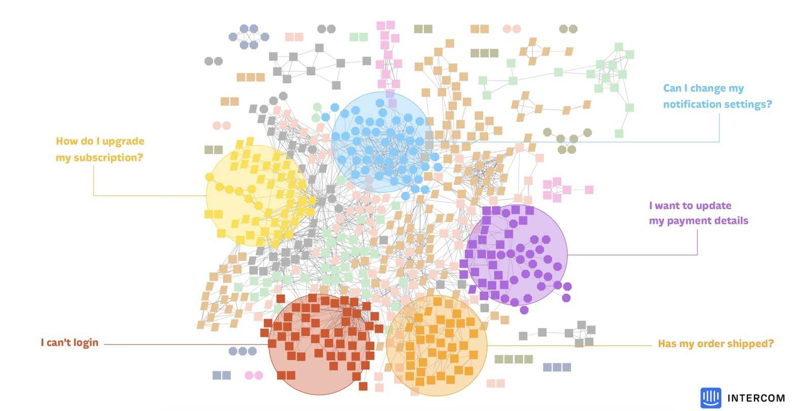
For customers who already had significant history of inbound conversations, we were able to successfully identify the most common "islands" or "clusters" of questions, and then bubble those up to be surfaced as a set of suggestions, as a way for customers to quickly get started with the product.

For instances where there wasn’t enough history to identify clusters, or where the customer wanted to define a question/answer pair that wasn’t one of the suggested starting points, we provided a simple interface for defining the question based on a keyword search, and then a set of tools for training the system to match the question to the right answer.
Initially, due to a combination of limitations in our ML algorithm and our desire to avoid attempting to answer questions that hadn’t specifically been defined by our customers, all our approaches revolved around the idea of keywords—i.e. that questions would only be considerd "answerable" if they contained one or more of the keywords that functioned as a "gate" for that question.
Eventually though, and with continued research in production for some of our beta customers, we were able to do away with the requirement for keywords completely, and this simplified the interactions required for training the system significantly.
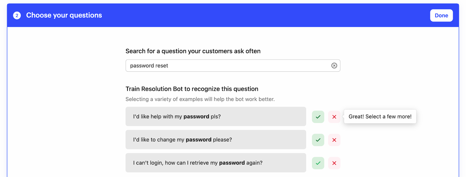
What we ended up with as the approach for selecting each "cluster" of questions was a simple keyword search interface, which would bring up matching questions, and allow the customer to do multiple searches to capture all the various ways the question is likely to be asked.
An interface for training
Within each keyword search for a certain phrasing of a question, our goal was to have customers select a few examples of inbound queries to train the system. Once we had a couple of examples, we could then start bubbling up examples which were lower-confidence matches for customers to review.
The reason we wanted to limit the interface to just a small number of examples at a time was that with each "yes" or "no" signal we got, our ML algorithm would quickly be able to either expand the boundary of it’s understanding of the "cluster", or to better define the boundary between clusters. Because each signal increased the resolution of the system’s understanding, this interface choice made it much more natural for customers to provide the right signals.
A key thing we learned as we iterated on the underling ML system was that what actually mattered more for accuracy was not how well trained each individual question was, but the overall coverage of the query space. Having a greater number of losely defined "clusters" provided a better signal and accuracy than a small number trained with a large number of examples.
Because of this, when it came to the question of helping customers understand when any specific question has been trained "well enough", we opted for a simple heuristic of 10 training examples. To make this heuristic clear, we included a visual indicator of "training progress", which wouldn’t prevent people from doing further training, but gave them a milestone to aim for.
Composing answers
With the question side of the equation covered, we needed to provide a way for customers to define the answers they wanted to deliver. We knew from our research, and from our instrumentation of existing features like "saved replies", that customers were already used to composing content in a simple text editor, so we opted to keep things simple and familiar.
Rather than having each answer be a long-winded piece of content, we designed the answer composer to favour short messages, perhaps over multiple chat "bubbles", and insert links to help center articles which offloaded the longer content to existing help center articles.
Having recently launched an App Store ecosystem as part of a complete redesign of Intercom’s Messenger, we naturally wanted to leverage the ability for Answer Bot to deliver apps to end-users as part of responding with an answer. Having this option instantly made the product more powerful, and gave customers a way to deliver more complex functionality without having to build it themselves.
Audience targetting
As the various pieces of functionality took shape, we began to manually onboard customers into a beta version of the product using high-touch sessions with our product managers and researchers. Of all the things we learned helping, one adoption barrier that stood out turned out to be hesitation around answers being applicable across their entire end-user base, with no way to control who would see what.
There are tons of good reasons customers were concerned about this. One of the complications of delivering support to a wide customer base is providing the right answers depending on the specific context of the end-user. For example:
- Questions about things like billing might have different answers depending on whether the end-user being supported is on a free trial, or a paying customer.
- Answers might depend on which country or region the end-user is in, or which language they speak.
- Some responses should specifically not be delivered to certain audiences, such as end-users who came from different marketing campaigns.
- To resolve technical questions, the answer might depend on which operating system or browser the end-user is using.
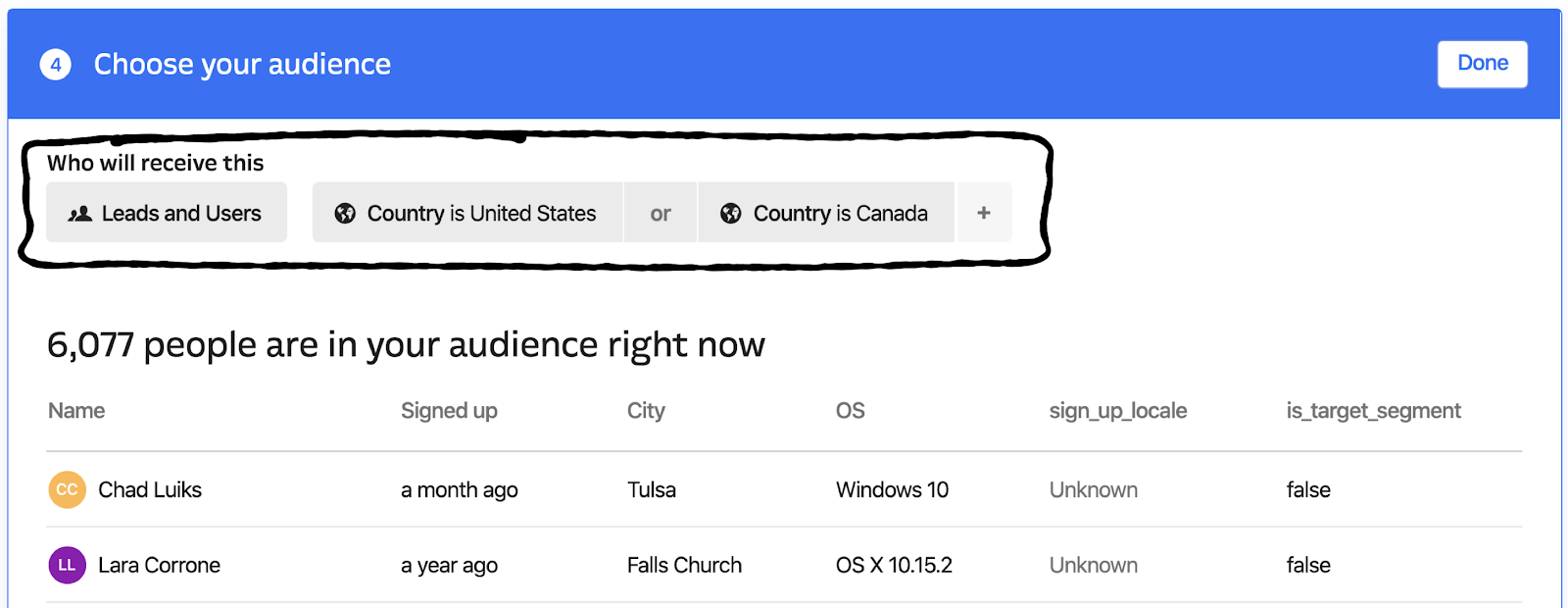
For all these reasons and more, we made a key decision during the beta to scope in the ability to target answers to specific audiences as part of our launch scope.

We knew from our research that customers were already used to targeting their outbound messages and other aspects of Intercom’s features to specific audiences, so we opted to leverage the same interface for targeting answers. That way, customers could easily target answers to the same audiences they were already using for their outbound messages.
Making impact visible
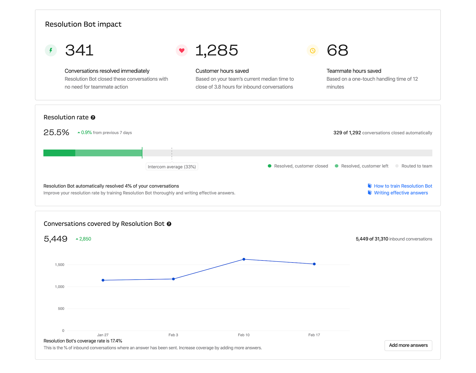
Building a product that functionally delivers answers automatically with any degree of accuracy is only one part of the equation. The other part is making sure customers can see the impact of the product, and understand how it’s performing.
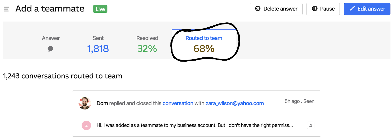
For an AI/ML-based product like this, it was important people didn’t see it as a black box. If things weren’t working, the feedbank and performance metrics we surfaced would need to help customers understand why, and what tweaks or changes they could make to improve things over time.
With my time split between leading design of the core product and helping coordinate launch planning, we looped in some of the other talented designers from my team in London, who had already been involved in other reporting and performance efforts relating to adjacent functionalitly lik Custom Bots and Operator.
Thanks to their wonderful design skills, we were able to quickly iterate on a set of reporting interfaces that would help customers understand how the product was performing.
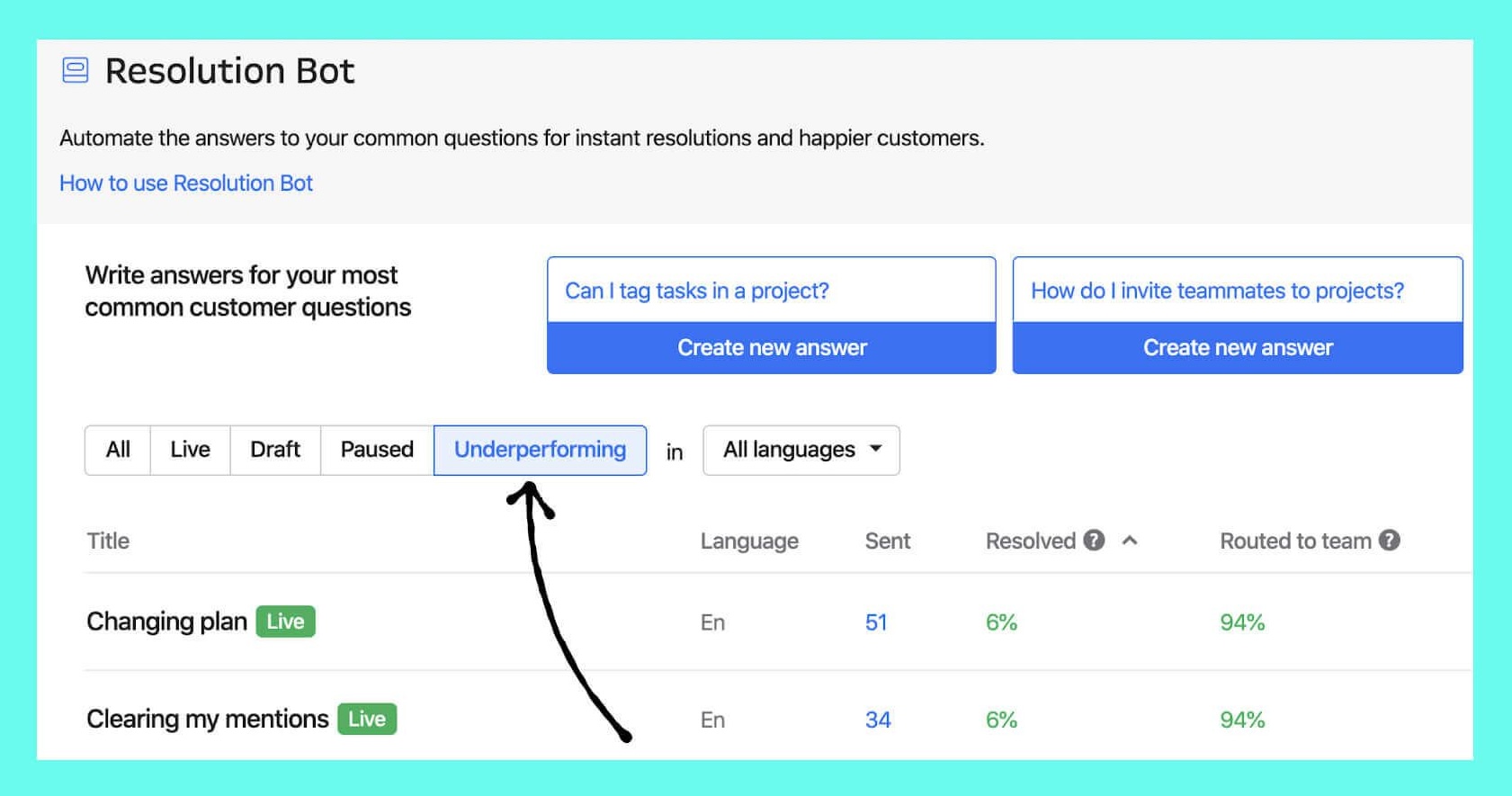
In addition to reporting on what was working well, we also wanted to make sure customers could quickly identify areas where answers weren’t having the same impact as others, so we ended up creating a dedicated "underperforming" section to help our customers cut through the noise.
Launching Intercom’s Next Chapter
As we added more and more customers to the rolling beta, we saw our dedicated onboarding process become increasingly unnecessary, and with the product consistently performing (beta customers were averaging ~30% resolution rates!) it was time to turn our focus to shipping this product to the world.
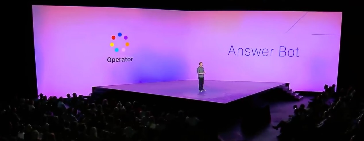
With this product coming hot on the heels of the launch of our new Messenger and App Store ecosystem, we were keen to capitalise on the momentum and excitement around these major upgrades to our platform. After conversations with leadership and our marketing teams, we decided to combine Answer Bot and the new Messenger functionality together as a single keynote-style launch event, which we dubbed "The Next Chapter".
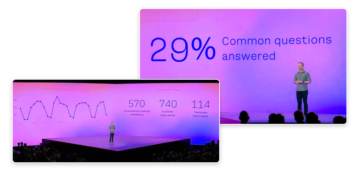
Seeing Intercom invest so much effort in a large-scale product launch made up almost entirely of projects that I led design on and helped coordinate was incredibly humbling for me, and one of the achievements I’m most proud of—not just from my time at Intercom, but from my career thus far.
