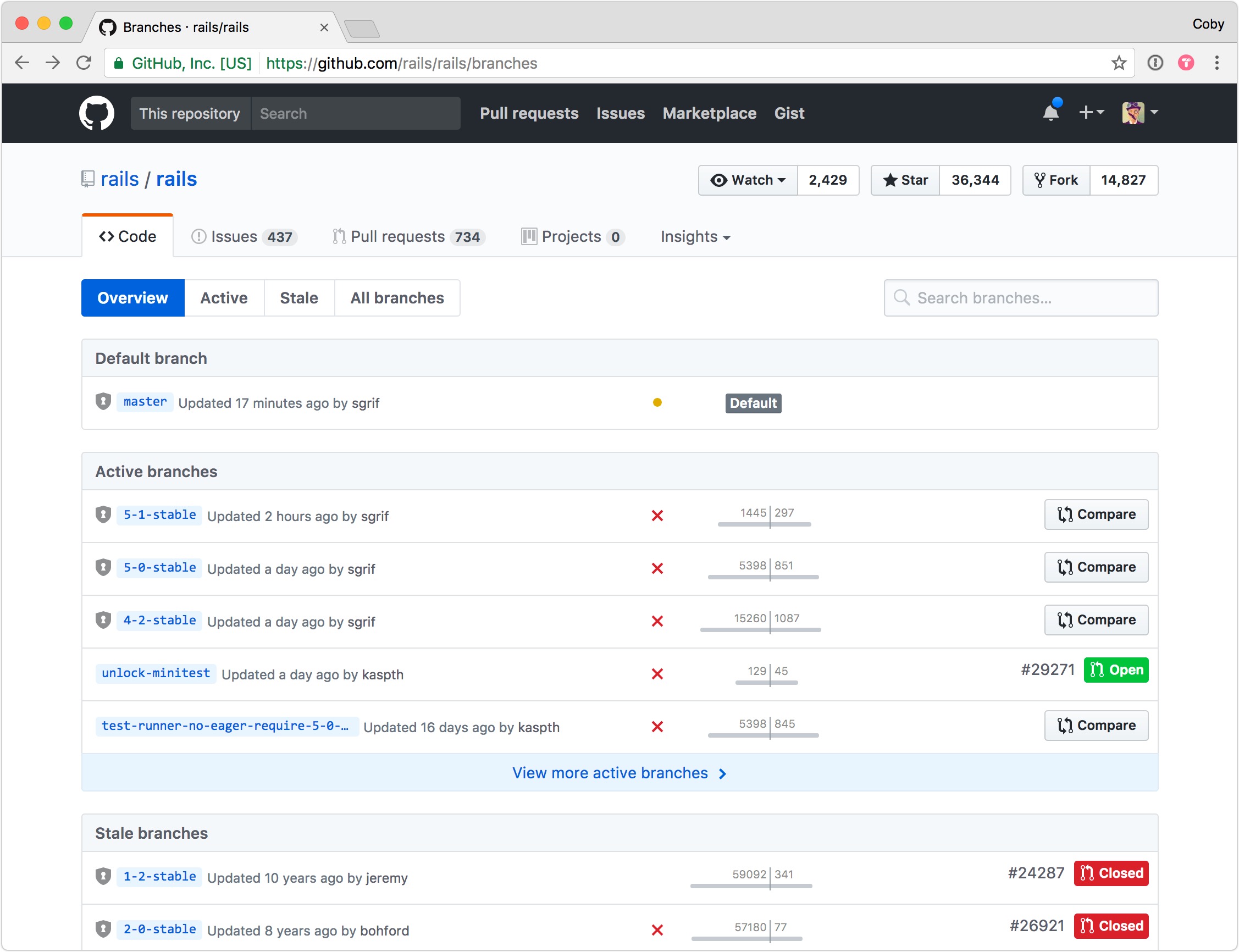
Performance-wise, the Branches page was previously one of the slowest endpoints of the whole site—with the list of branches taking up to 12 seconds to render for some projects. This had to change.
Note: Read the related announcement post on the GitHub blog.
Balancing interface-level utility with Git-level performance constraints was almost impossible, so a redesign had been avoided for years. When I tackled this project, I worked closely with engineers on the systems team to ensure the new design was both useful and performant. Ultimately we were able to reduce both the average and 95th-percentile load times to significantly more acceptable ranges (~200-500 ms)—all while improving the utility and focus of the page at the same time.

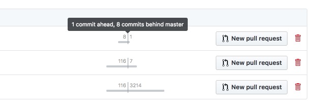
Scannability was a key goal on this page, since aside from the name of the branch—there isn’t much else to differentiate one from another in a long list. To combat this, I designed a small, unobtrusive graph to convey how far ahead or behind each branch is compared to the default branch. By adding a subtle animation to this graph as the page loads, your eye quickly becomes drawn to branches that are further in-front or behind.

The area that took the most iteration was the right-hand side of the screen. Due to the myriad combinations of user-, repository-, and branch-level permissions—as well as Pull Request existence and status—the available actions and meta-information needed not only to fit within a small space—it also had to be queried from the database (and cached… and cache-busted! 😅) without incurring performance overhead or state consistencies. This was… not an easy set of concerns to trade off against each other.
Despite the tricky constraints, between the animated graph, the commit status indicator, and the clear sections and actions, this new design ended up striking a satisfying balance given the tight performance limitations involved.
