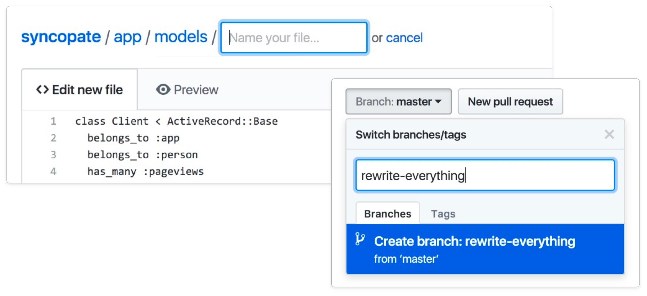
Helping people get hooked on GitHub was tricky, especially with the added complications of learning git and navigating the command-line too—so we lowered the barrier, and made it possible to quickly get a feel for the GitHub workflows in the browser, without having to dive into git on the command‑line.
We knew from early onboarding research that people who used pull-requests early on in their GitHub journey were the most likely to end up becoming engaged and successful users over the long run. What we needed was a way to help new users achieve the basics of collaboration using only their browser.

In an ongoing effort we internally began referring to as Web Flow™, I’d made it my mission to spearhead the expansion of as many of git’s atomic actions (typically only achievable with a local clone of a project’s repository via the command-line) to eventually be achievable using the browser alone.
For an unbelievably long time, the only thing that existed was a simple "edit this file" feature, with an embedded Ace interface. That was a great start, but on its own it the functionality was way too limited to be effective, for a bunch of reasons:
- The file had to exist in the first place.
- You couldn’t create, rename, move, or delete files.
- You could only commit an edit to the existing branch.
- You couldn’t create branches, thus preventing pull-requests too.
- etc, etc…
So I went about tackling all the basic actions one by one—building browser-first versions of each piece of command-line/git functionality, and reshaping the UI affordances at the repository level to be obvious and as straightforward as possible.
First was creating files. Then came moving and renaming. Then deleting files. Things were starting to take shape!

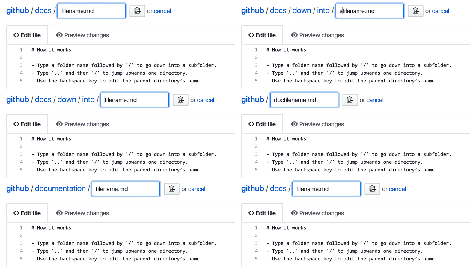
Moving and renaming files proved to be a tricky interaction to design, for a number of reasons. You might want to move and rename a file at the same time, the destination folder might be further up in the folder tree, or the new location may not even exist yet. It’s hard to provide access to such flexible functionality with only a small amount of space, without cluttering up an already-complex interface.
In designing the solution we ultimately chose, I leaned heavily on the conventions used by command-line applications—with slashes delineating between folders and sub folders, and with ../ acting as a way to navigate to the parent directory.

With the absolute basics in place, it was time for the next round of new functionalty. Things started flowing thick and fast—creating and deleteing branches, creating quick branches and PRs for edits, making edits from inside PRs, tidying up after pull-requests, reverting pull-requests, even mobile-friendly actions, and the list goes on!
With all the foundational components shipped, we could finally say with confidence that the full set of GitHub Flow collaboration workflows (like pre-emptive branches, and the full life-cycle of pull requests) was now a possibility using only the browser.
Making so much possible without having to leave the browser opened the door for all kinds of new efforts—from helping new users onboard and get the hang of GitHub, to making our Training Team’s job significantly easier in terms of the tutorials and guides they were able to produce, and much more.
The overall lesson I took away from leading this work was clear—no feature within a product ever exists in isolation—features are only as good as the surrounding adjacent features with which they collectively enable wider systems of interdependent workflows.
If there’s one achievement I’m most proud of from my time at GitHub, it’s almost certainly taking the reigns of this wider initiative, and driving it thoroughly to its completion as a comprehensive set of workflows. It was truly humbling to press "ship" on work that’s enabled thousands upon thousands of interactions and collaborative actions, many of which may not have happened if the barrier of navigating local clones and command-line complexity.
